
KNICKS 75th
KNICKS 75th
The Misson
A campaign centered around the celebration of one of New York’s prized possessions-The Knicks and their 75th anniversary.The goal was to exhume lineage of New York basketball while rallying for its present.This is as New York as it gets.
Brand x Campaign Design
CONCEPT Building
Visual Language
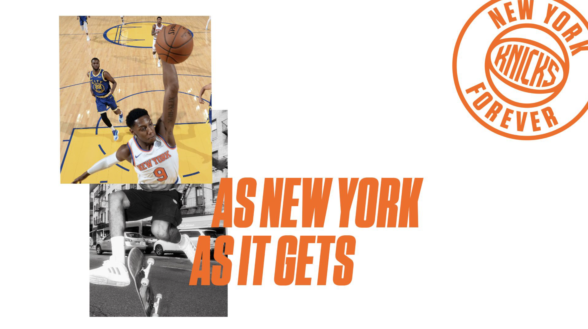
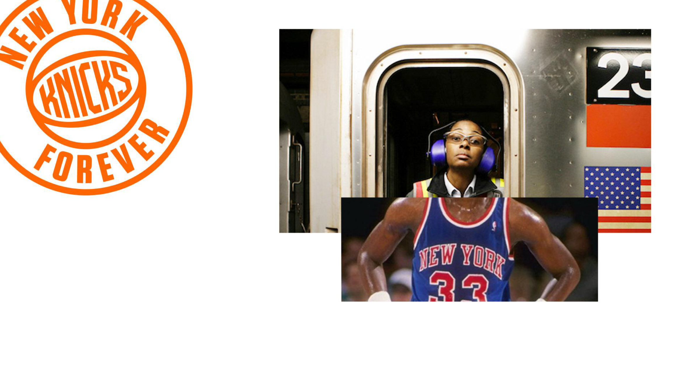
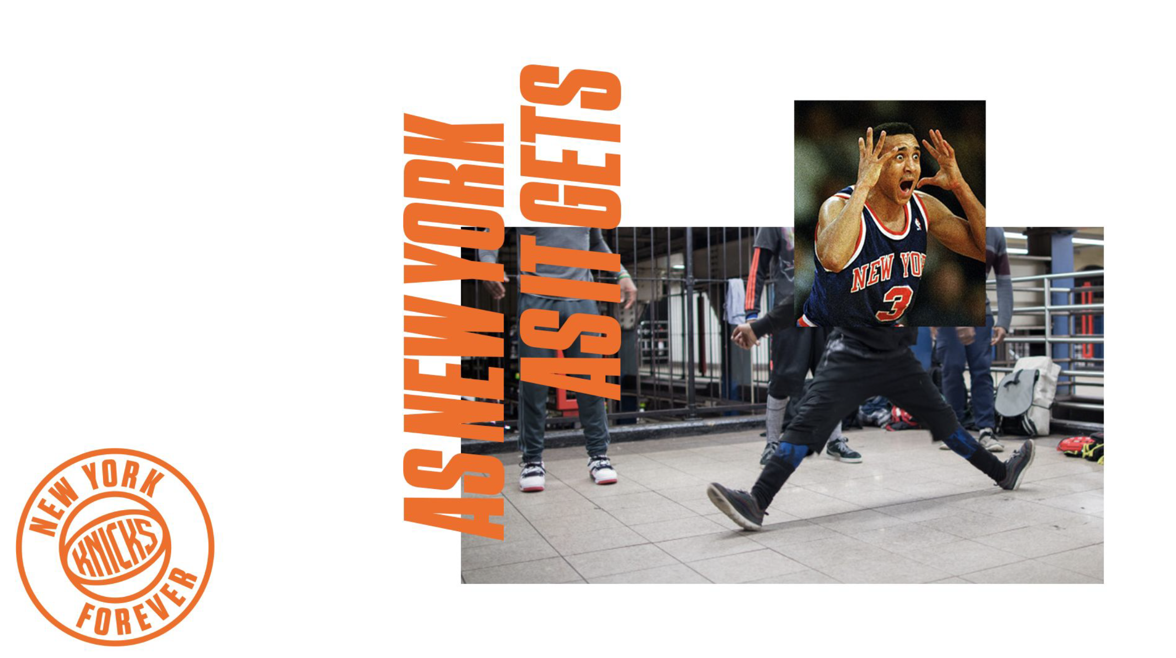
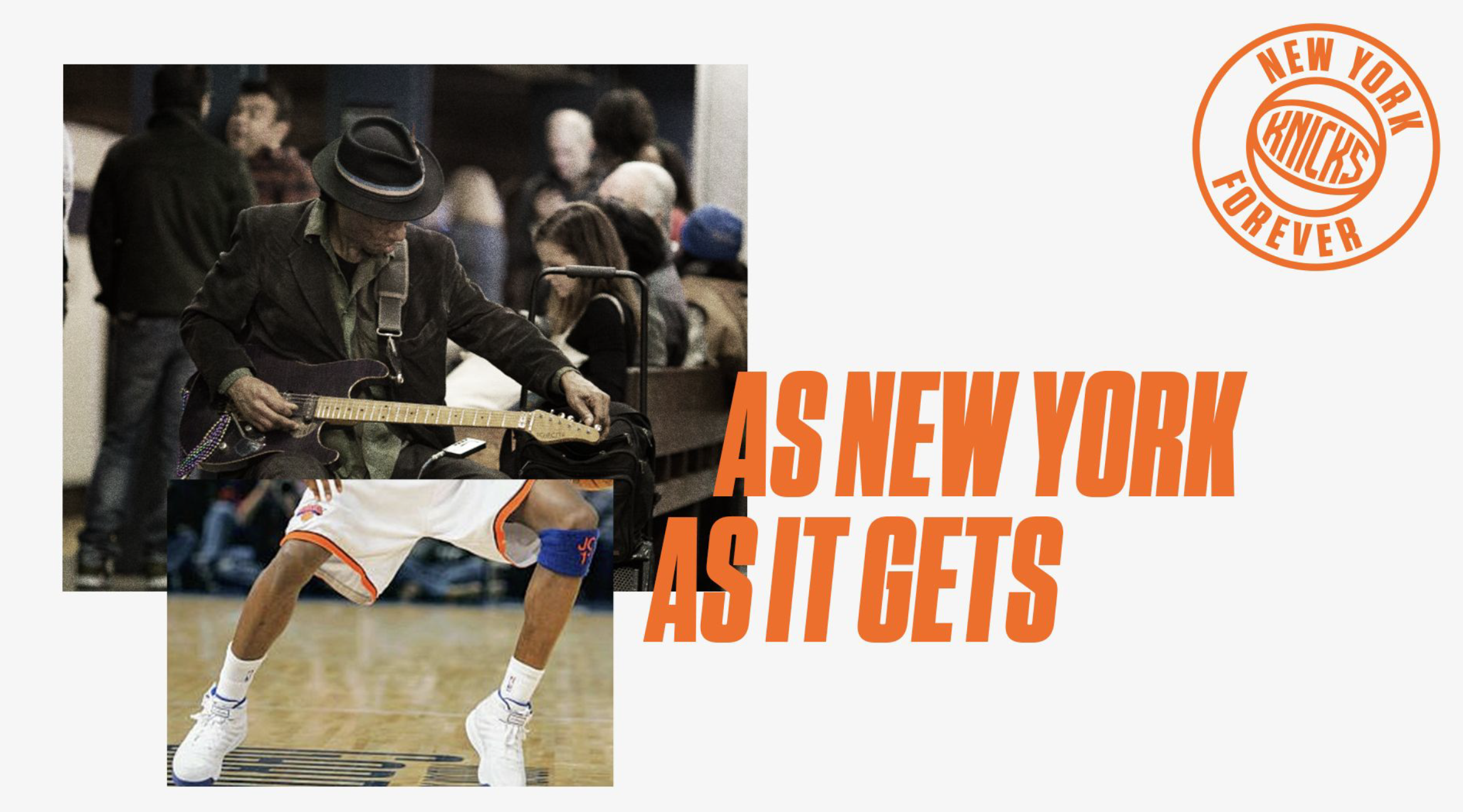
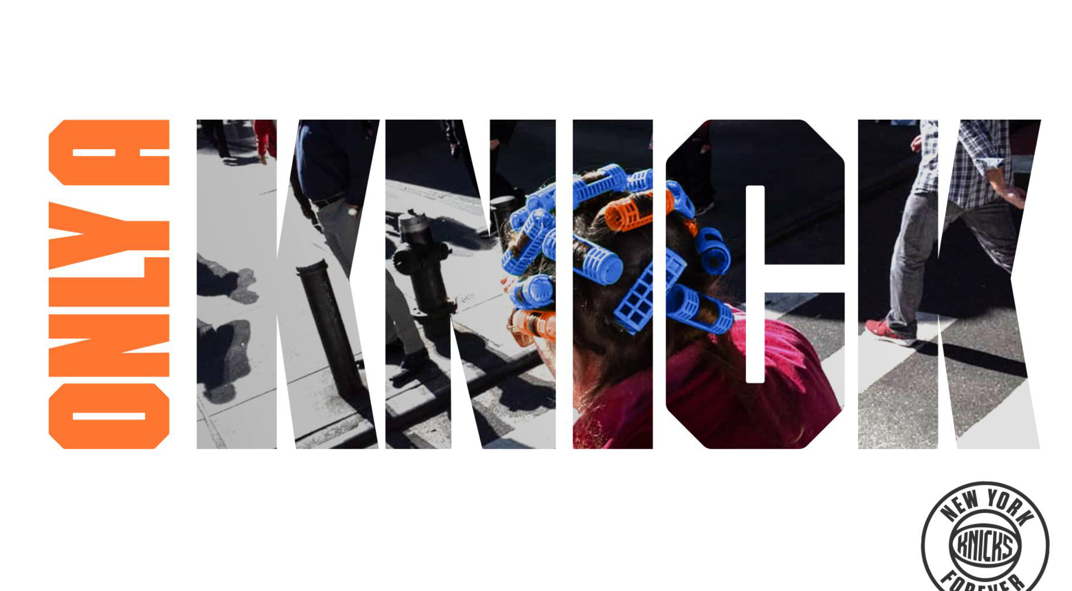
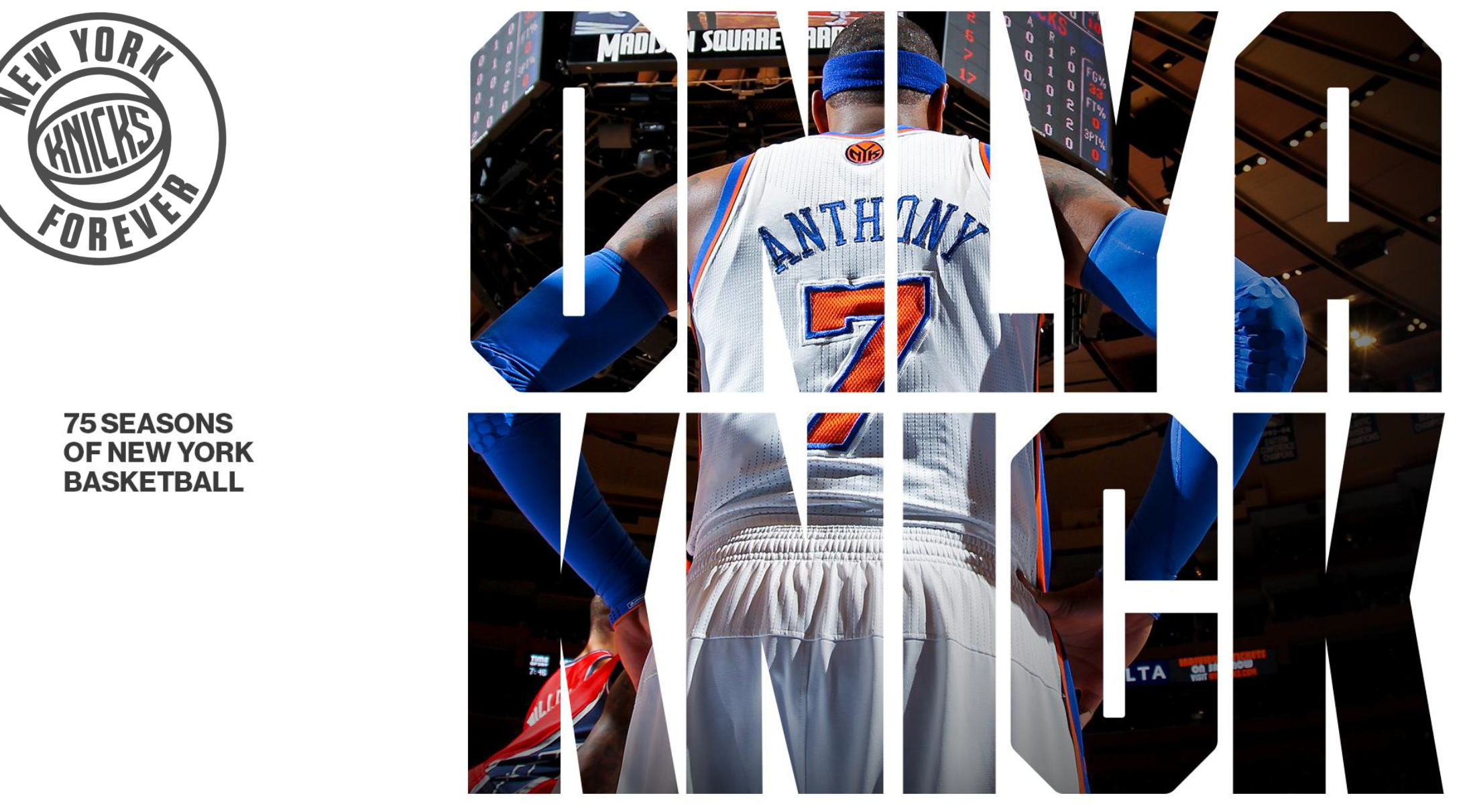
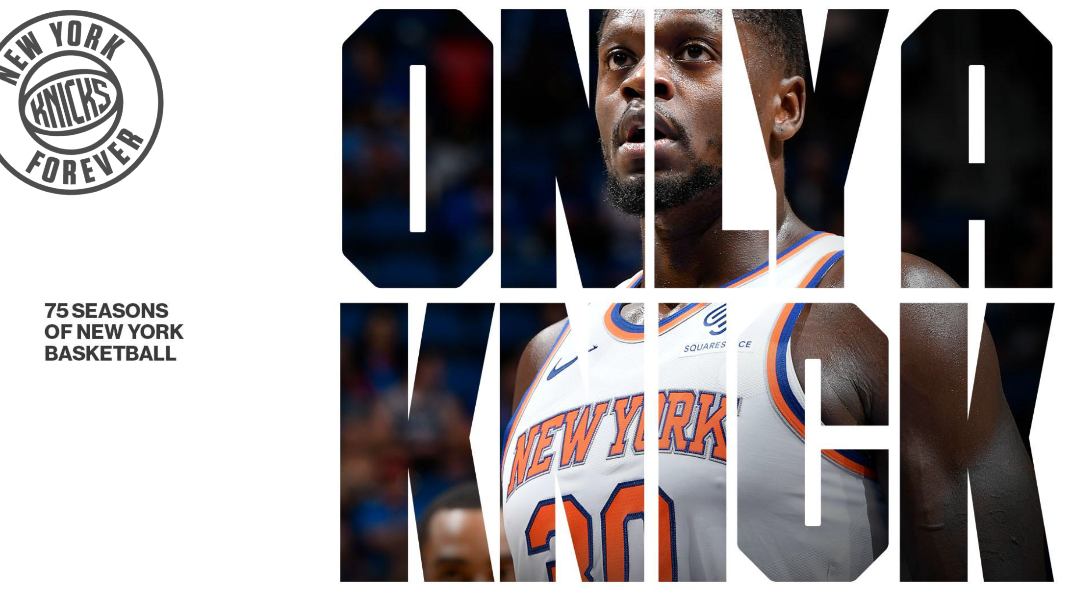
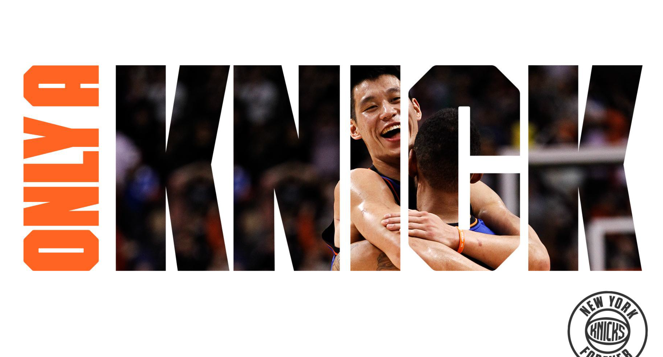
New York By (new) York
CELEBRATES THE KNICKS BY CEMENTING THEM AS THE MOST NEW YORK OF ALL NEW YORK THINGS.
Simple collages that combine action shots of Knicks players with shots of everyday moments around NYC. For example, we show an image of Julius cheering on his teammates from the bench at MSG, cropped from the waist up. Where his legs should be, we instead see the lower half of a New Yorker seated on the L train.


Visual Language
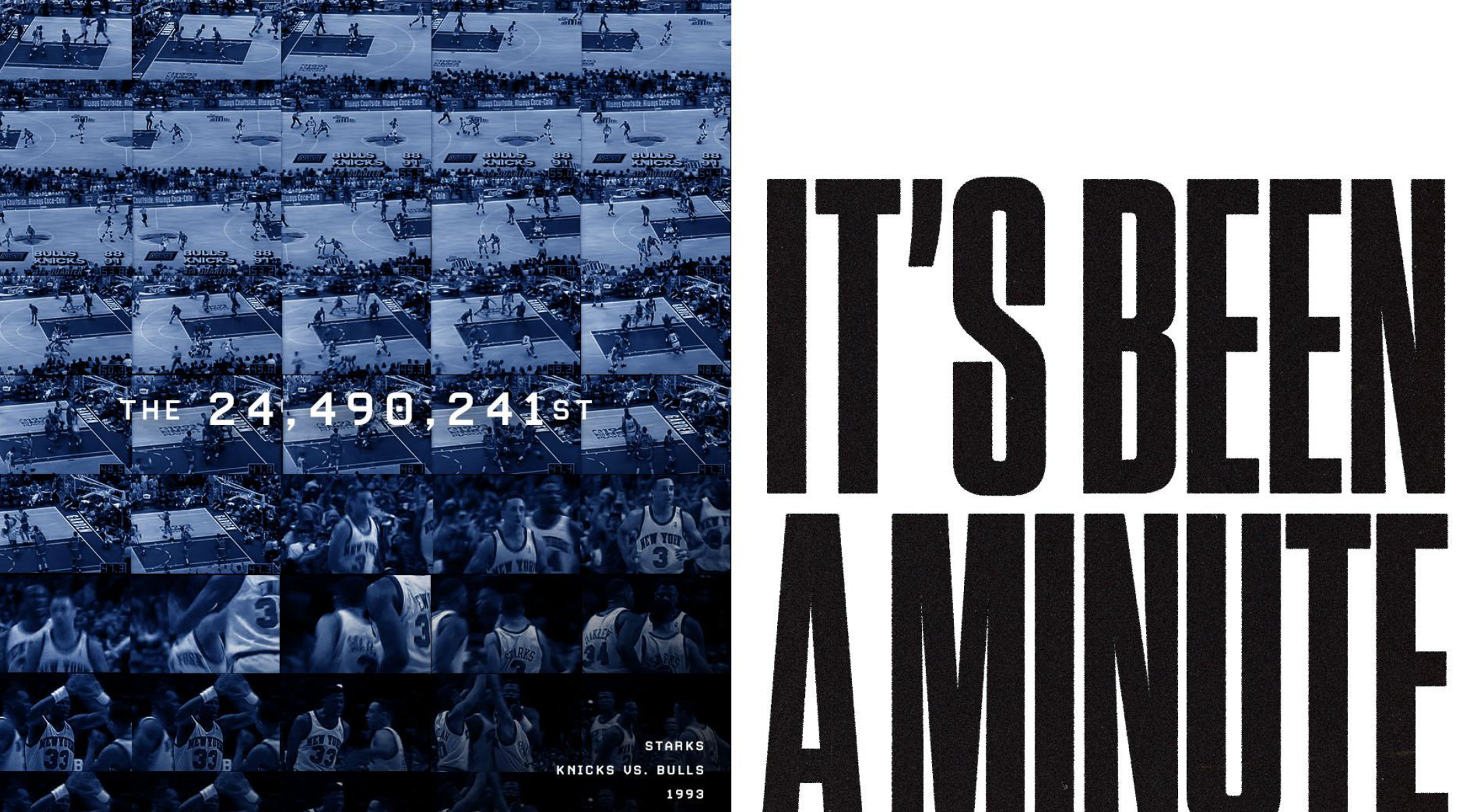
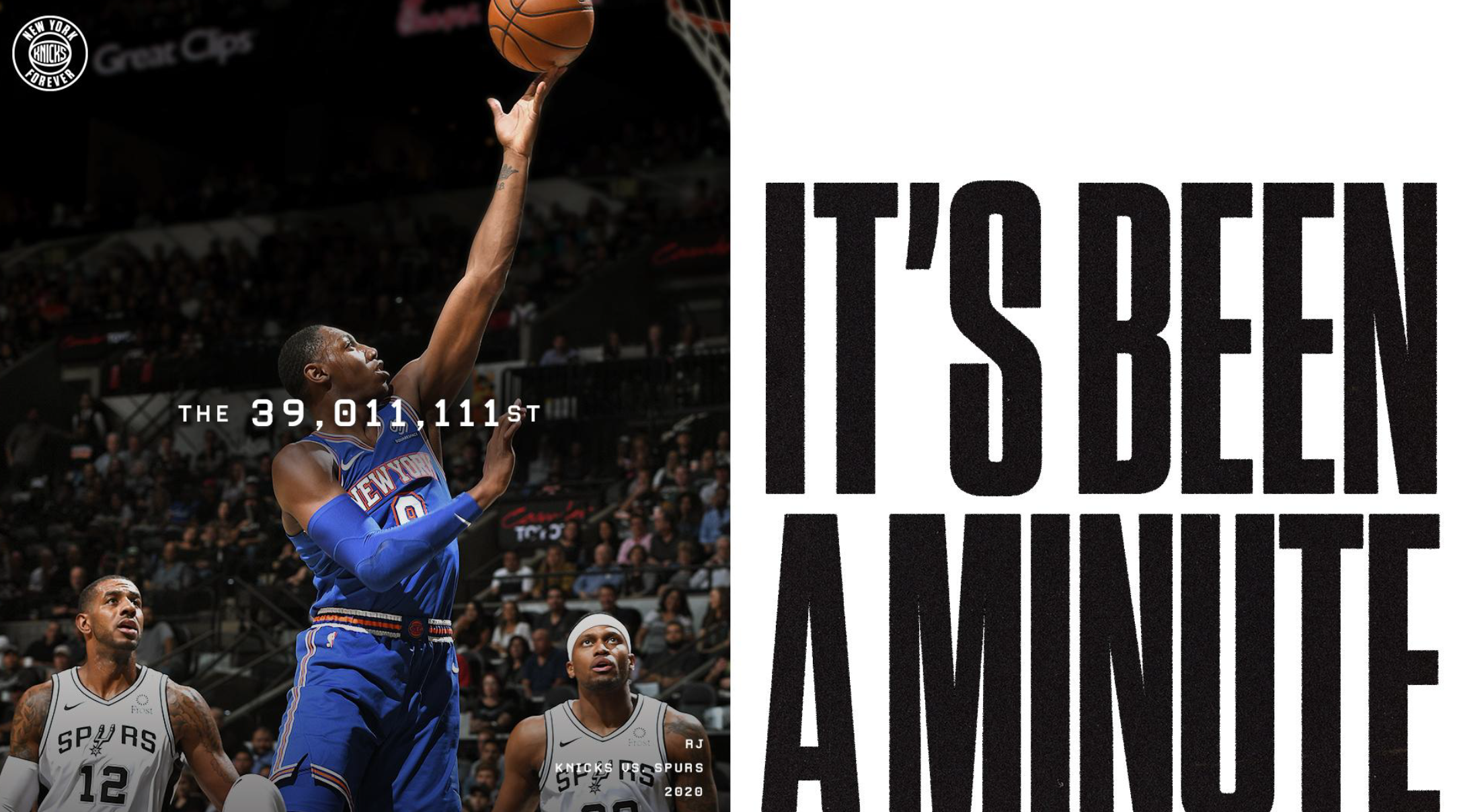
Its been a minute
LOOKS BACK AT OUR 75 YEARS OF HISTORY IN A CITY IN WHICH 75 YEARS IS AN ACTUAL ETERNITY.
This direction utilizes epic, large-scale photography of Knicks moments throughout the history of the franchise that are time-stamped with specific date/time information.Photography will be accompanied by two contrasting type styles – a bold, modern sans serif and a vintage-style monoweight that speak to the convergence of past and present Knicks moments within the campaign.


Visual Language
Its a fan thing
CELEBRATES THE MAIN REASON THE KNICKS HAVE BEEN AROUND FOR SO LONG: THE MOST INSANE AND UNREASONABLE FANS IN THE WORLD.
With a heavy emphasis on photography, this direction highlights New York moments that can only exist within the Knicks franchise and fandom. Bold declarative typography will be paired with documentary-style photography of devoted Knicks fans dealing with everyday NYC hardships, as well as in-game photography of legendary Knicks moments.


Team
ART DIRECTION - DESIGN DIRECTION
-
Description text goes here
-
Description text goes here
-
Item description